

Designing a user-friendly dashboard for real-time asset monitoring.
Our Purpose:
Client
3ti
Industry
Environmental services
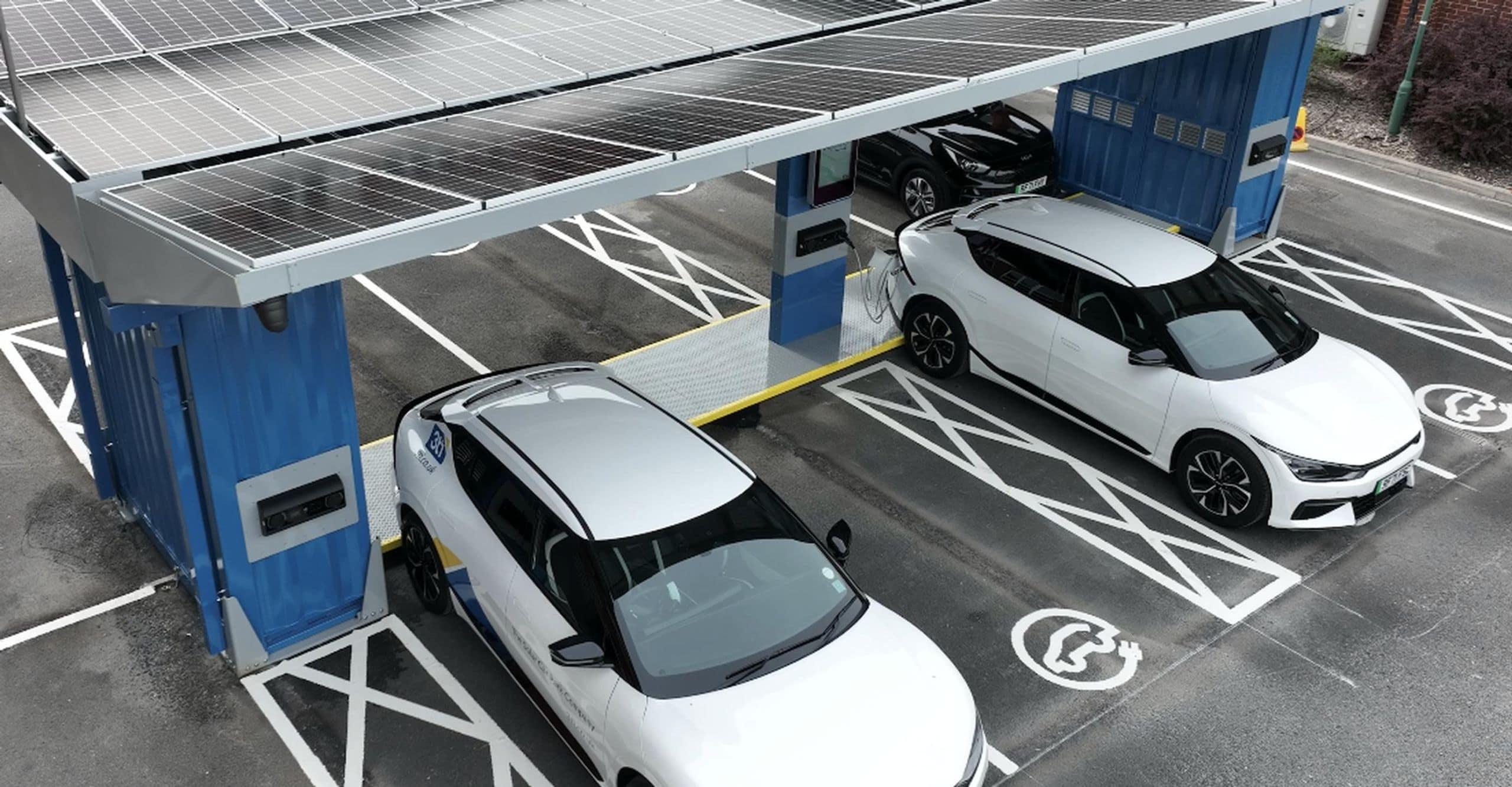
3ti manages a network of P3 smart infrastructure devices that collect valuable data on energy use, storage, and electric vehicle charging. While this data was available in real time, it was locked away in hard-to-read JSON files and database queries, making it inaccessible to most staff, clients, and investors.
The challenge was to design a simple, intuitive dashboard that keeps internal teams informed and engaged, while showcasing 3ti’s green credentials and demonstrating tight control over its assets to potential clients and investors.
Our role focused on designing and building the HTML and CSS front end of a comprehensive Dashboard App for internal use. This app presents live and historic data clearly across multiple devices and includes a live map showing deployed P3 locations and statuses, detailed site-level screens enhanced with local weather and historical summaries, and responsive layouts for landscape, portrait, and mobile views. We worked closely with the development team to integrate secure API data access and incorporated third-party charting and custom infographic components to simplify complex data and improve usability.

‣ Design
Making complex data clear and accessible.
Our design approach centred on clarity and ease of use for internal teams who rely on real-time data to make decisions. We created clean, modular layouts that organise complex information into digestible sections. A key part of the challenge was interpreting technical data and designing graphs and tables that simplified it visually with the use of clear illustrations, iconography, and visual hierarchy to aid understanding at a glance. The designs include a live map, detailed site-level dashboards, and responsive layouts that adapt smoothly across landscape, portrait, and mobile views, maintaining consistency and accessibility throughout.


‣ HTML Development
Building a reliable interface for internal use.
We built the front end using semantic, well-structured HTML and CSS to deliver a responsive experience across devices. The templates were designed to be modular and reusable, supporting dynamic data injected via secure API calls handled by the backend. Special attention was given to performance and security by keeping API keys and tokens away from the browser. The front end integrates third-party charting libraries and custom infographic components to translate raw data into clear, visual insights for users.
